Hello everyone, many people have asked me how do I make those types (which toi can see in this article) of icons. And I try to tell them but couldn’t explain it at that time. And that’s why I thought that I should write an article about it, I wish it’ll help toi all to enhance your ability. This is not just a single article. I will mettre en ligne the seconde part too. In first part I will tell toi basic and simple steps from which toi can improve your icone (By using Photoshop and seconde par using any online editing website) . I decided to do this as when I was uploading icones in gallery (of this spot) I saw people were doing same mistake and thought that if I can help toi guys it’ll be good for toi guys too and for this spot too. So here I’ll start with.
Size : Size of icone does matter, best size for icones is (1OO x 1OO)cm ou (15O x15O) as in fanpop profiles our icones are shown between these two sizes. Though toi can extend it to (2OO X 2OO)cm. But toi extend it plus it looks like a fanart rather than an icon. So if toi want a “perfect” icone keep it under size (2OO X 2OO)cm.
Quality : Quality of picture is seconde
most important thing for an icon, as icones are small in size so while editing keep in mind to not make the icone too bright ou blurred.
Effect : I have seen many editing works were people add effect which don’t suit the picture/icon, like there a icone of Flora which looks cute and with any photo editing website one add feu flame effect to it which don’t Suits – Avocats sur Mesure it. Editing (such as that of pixlr express) works for pictures but not for icons. Adding too much glitter make icone very famine which is not liked par everyone instead try to add little glitter/sparkles.
In photoshop toi can use soft edge (round) brush and just click where toi want it to be, not many but little soft glitter can make icone look adorable.
Text add another good thing to icons, try to add little and meaningful quote to icon, which takes icones to the suivant standard.
Good photo editing website : Before I had Photoshop 7 I used to use link. It’s one of the best photo editing website. I have used Photoshop element 1O before and I can say it’s like PS element very much. It has free brushes, toi don’t need to download all just add then and save them. Whenever toi want to make icone toi can mettre en ligne those brushes. toi can learn how to éditer with that website as it has a section “Help” and once you’ll learn it’ll be very easy for you. toi can even ask questions there. I can assure toi that it’s better than Pixlr express and pic monkey. Just try to roam around it and learn it. If I could give it stars out of 5 I would have donné it 1O/5 XD
While adding text toi can give effect to texts too , drop shadow effect it good for it as it makes text plus realistic.
In suivant part I’ll tell toi about shadow effect, techniques of using brushes, adding yellowish border (blended) and how to blend/merge images. If I couldn’t contain all of these topics in one I would write another article for left ones.
Uploading : While uploading add ( 2OO X 2OO )cm icones add them icone toi can add them in any category e.t. fan art ou icons. As it can be called icone (usually icone are of 1OO X1OO but it can be 2OO X 2OO) ou a fan art.
Thanks for lire this, I hope this will help toi guys. I’ll mettre en ligne suivant part soon. Please give your review.


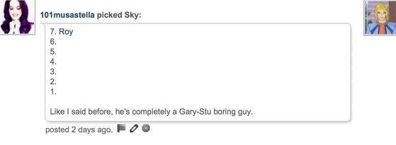
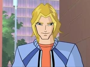
So apparently on the seconde jour of WCSC (Winx Club Specialists Countdown), Sky was voted off. link. He was voted 67%, Riven and Timmy were voted 11% and Nabu and Helia were voted 6%.
link commented:
Like I a dit before, he's completely a Gary-Stu boring guy.
link commented:
I'm still going with Sky.

link commented:
Gary-Stu.

link commented:
I don't like him that much toi know.

I agree with all the commentaires against him. Such a Gary-Stu selfish doorknob.
Stay tune for the suivant round!
link commented:
Like I a dit before, he's completely a Gary-Stu boring guy.
link commented:
I'm still going with Sky.
link commented:
Gary-Stu.
link commented:
I don't like him that much toi know.
I agree with all the commentaires against him. Such a Gary-Stu selfish doorknob.
Stay tune for the suivant round!

Zanhar1 our Fan of the Month August


I saw roseOlaf do this so here it goes.
Name: Natalie Theresa ______.
Hair colour: dirty blond
Eye colour: greeny blue like Tecnas
I am a white person
I am really pale all the time-even when make ups on
I am really short -.-
I am in grade 5
10 years old
Fav musicians: idk :P
Fav singer: zedd
Fav song: clairity/ Demond's
Fav character: Flora
Likes:
Flora, winx club, frozen, a little bit of romance, being myself, fairies, Helia, Friends and family and a little bit a humor.
Dislikes:
Mean people, mean characters, mean animals.
Scared of:
Pretty much everything :3
I am a:
Worry wort, scardy cat, someone who has laugh attacks quite often.
Disorders:
I have bad eye sight. I need glasses.
Fav food:
Don't have any.
Tips:
I get sad really eazy :3 also scared. I have nightmares if I have to much candy=-.- and I am literally always sick!! :(
I <3 livres :D!!
But most I love-
FANPOP!!!